
These exit intent popup best practices will help you capture more leads using exit intent popups. Popups shown when your website visitor is about to leave your site.
Visitors have a short attention span
What we sometimes forget is that we have only mere seconds to win over a website visitor before we potentially lose them forever.
In fact, we have no more than seven seconds to capture a website visitor’s attention.
While you want to ensure that your content is engaging and your website design clear and easy to navigate, a key component to snagging your visitor and converting him or her into a lead ties into your use of effective exit-intent pop-ups.
Pop-up ads get a bad reputation, but they’ve come a long way since their initial, annoying creation. Check out our overview of pop-up ads and tips to generate more leads.
Confirm your trigger
Depending on the system your using, you want to be sure (and test) what prompts your exit-intent pop-up to appear.
Is it scrolling? Lack of scrolling? Mouse movement? Lack of mouse movement?
Be sure to test the behavior so that it makes sense on the user’s end. Are you actually about to exit when the pop-up appears? The right timing is everything.
Customize your angle
Depending on what webpage your visitor is about to exit, you should cater your message to that experience.
For example, a “Don’t go yet. Here’s a discount” message could hit home for someone about to leave your pricing page. Or, a “Download this exclusive content” message could catch the attention of someone reading one of your blogs. Of course, you also could battle shopping-cart abandonment with a reminder that they still have items in their cart and offer free shipping.
One size simply doesn’t fit all, so take a look at your website traffic. Where are people browsing, and where can you cater different exit intent popups for them.
The simpler the better
An exit intent popup best practice is to keep your popup simple with a clear, concise offer and an obvious call to action. We recommend including a graphic for visual interest, but it isn’t required.
People simply don’t have the time or patience to engage with an approach that’s long-winded and potentially boring.
Think of your popup as a micro-landing page. Put in the same amount of thought as you would into a landing page.
Be precise in your description. For example, if your offer is a 15% coupon a good description is “New customers are eligible 15% off their first purchase”. Or, if the offer is to sign up for a newsletter: “Love our blog? Can we send you our best articles once a month?”
Take a look at our examples of exit intent popups for some ideas.
Focus on usability
An exit intent popup is disruptive and interrupts your visitor’s actions. This is great because it quickly gets their attention, but can be bad if you interrupt a meaningful action such as checking out or reading content.
An best practice for all your website popups is to enable them to be quickly dismissed. Some ways that visitors expect to dismiss them:
- Clicking outside the popup area
- Clicking a close button or X in the popup itself
- Pressing the escape key
Not following these recommendations risks visitors simply abandoning their visit.
In addition, to quickly closing the popup, ensure that your popup follows other best practices:
- If a visitor closes an Exit Intent popup, don’t show it to them again unless they request it
- When a visitor follows a call to action you should always reaffirm the action with a thank you page and welcome email.
Always experiment
Whether it’s your wording or your visuals—or both, don’t let your exit-intent pop-up linger in a static state.
Beyond just trying what might continue to perform better, you’ll want to change up your pop-ups every so often anyway to keep things fresh (and just as enticing) for any returning visitors.
When it comes to wording, the word “wait’ is especially powerful and worth trying out.
A/B test your exit intent popups
We can’t emphasize enough how important A/B testing is.
It is absolutely an exit intent best practice.
By running a series of experiments with your exit intent you can directly see how different layouts, colors, content, and call to actions impact your conversion rates.
Offer something irresistible
According to Adweek, 81% of Shoppers Conduct Online Research Before Buying. Just like you, these shoppers, whether they are consumers or business buyers, like to do research before starting the sale.
The good news is that thanks to search engines like Google there is an enormous amount of information available to them. And the bad news is that there is an enormous amount of competition for you!
Understand the visitor experience
To effectively use exit intent you have to first recognize what has happened:
- A visitor has come to your site.
- The visitor has not found what they needed.
- The visitor is leaving – probably back to their search page.
The visitor is leaving your website because you failed to give them what they were looking for.
Your exit intent is your last opportunity to convince a visitor to convert on an offer.
Offer something of value
A best practice is to offer something of value or from a visitor’s perspective: how does this help me?
- Signing up for an industry specific newsletter that you publish.
- Access to white papers or other research to help educate them about their purchase decision.
- A unique offer, such as a discount code.
- An offer to send them a reminder email that they visited your website.
Put yourself in your customer’s shoes when thinking about your value offer!
Granted, what the offer is totally depends on your brand, your goals and what reasons people have to go onto your website.
Offer to chat
You don’t have to have an operating 24/7 live chat for this strategy to work.
Your exit intent popup could simply offer the opportunity for a visitor to submit their information so that you can contact them to set up a time to chat.
Of course, this does work with a 24/7 live chat as well.
Embrace an emotional connection
It’s admittedly tricky to connect on a deeper level with our website visitors in only so many seconds.
However, this can be achieved by solving a (common) problem for the user.
For instance, if you’re an e-commerce site, your exit intent popup could tout your 30-day guarantee refund policy.
Put yourself in your visitors’ shoes. What could be some common problems that either push them to bounce from your site or other problems you could solve for them in general with your product or service. That’s a great place to start.
Try humor
Similar to creating an emotional connection, humor can go a long way in connecting with visitors.
But beware.
Not everyone is as funny as we think we are.
Make sure you get a second, third, even fourth opinion on your quip before going live with it. Some of the biggest online brand mistakes occur when a company thinks they’re being funny, but it’s actually confusing or (even worse) offensive.
Show your authority, expertise
This can be done in a number of ways. You can include a customer’s testimonial on your exit-intent pop-up.
Social proof (like stating “Join 500-plus marketers in”) also conveys that you’re not just any website, you’re a trusted authority that has a website.
Your credentials can be shared as well.
It all depends on your brand and what makes sense to include with your message.
Urgency spurs conversion
When an offer feels like it can be used anytime, users don’t necessarily feel like they have to act right away.
So, it only makes sense that not only does your exit-intent pop-up catch the eye but also convince the visitor that the time to act is right now.
There are a number of ways to do this, such as a countdown timer or even simply stating the deadline (whether it’s one hour, 15 minutes, today only, so on).
Scarcity also spurs conversion
Whether the time you have to act on an offer is limited or the number of spots or products is limited, users will feel more compelled to act.
You can convey the scarcity of your product or service in an exit-intent popup to help add to the need to act immediately.
Animation advantage
What catches the eye more than a compelling image? A moving compelling image.
When possible, the simplest animation tricks can help stop that exiting visitor in his or her tracks.
And simple could mean a moving arrow pointing at your opt-in button or email form field. It also could do more than that. Just be sure that it’s not so complex or in-your-face that it comes off as spam.
Opportunity to cross-sell or upsell
What’s better than a website visitor making one purchase? That visitor making an additional or bigger purchase.
Think of when you’ve added an item to your online shopping cart in an e-commerce site, and you see a pop-up sharing similar items or accessories for the item you just added to your cart.
In an exit-intent pop-up, for example, this could be the time to not only show the item the visitor forgot in the cart, but also an item that goes with it (perhaps with a discount offer).
Not an e-commerce website? You could always show related content to entice readers to stay.
Use numbers
This might sound like a basic tip, but numbers (especially odd numbers) can definitely catch the human eye.
If it makes sense to include a number in your exit intent messaging, remember that some numbers sound bigger than others. For example, 60 minutes sounds like more than one hour, but they’re equal. In addition, 200% sounds like more than two times.
Play around with what numbers are the most compelling to share and how you want to share them.
The power of personalization
If possible, being able to call out your website visitor by name in your exit-intent pop-up can really catch his or her attention.
You can do this by obtaining your visitor’s name when they subscribe to your email list, by asking for his or her name in a previous popup window or by detecting the name of an existing customer. It definitely depends on the setup of your website.
But personalization can be more than just a first name.
You could identify the referral source of that visitor. For example, someone who arrives at your website through Pinterest can see that called out in his or her exit intent popup.
Take a second look at your call-to-action
Your call-to-action (CTA) button can be so much more than a simple “Yes.” The sky is truly the limit on creativity, whether you go more conversational or humorous on your CTA buttons.
Be sure to experiment with different CTA buttons. Then, measure and compare the conversions of each.
On that same note, you can experiment with “Yes/No” buttons, where you can have one button saying something like, “Yes, I want to save 15%!” and the other saying, “No, I don’t like saving money.”
Mobile matters
Mobile browsing is a dominant force and will only continue to grow in usage.
However, mobile exit intent doesn’t work quite the same trigger-wise as it would on a full browser with a mouse.
Consider using such triggers as browser switches and “back” arrows.
Then, be sure that your design, sizing and message works on smaller screens. Again, one size does not fit all.
Your tone matters
The tone of your Exit Intent matters. Don’t be patronizing.
For example, let’s say you are looking for a new Wi-Fi enabled pet tracker (such things do exist). You’ve spent a few hours on a Sunday afternoon using Google to hone in on the products you want to research. You’re on your third website and you trigger an Exit Intent behavior only to be presented with:
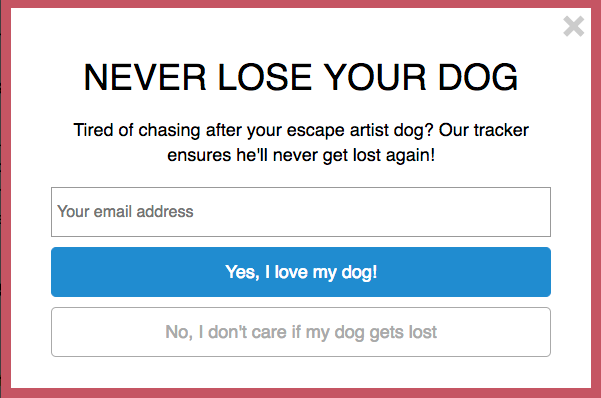
Maybe you’ve seen popups that uses this strategy. Known as “Confirm-shaming” it insults you for not opting in.
Don’t confirm shame
The psychology behind this is effective because it forces you to do something that you don’t agree with to dismiss the popup.
But don’t be fooled, this has proven to create a negative impression of your brand/product.
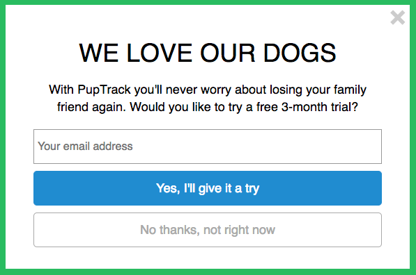
Focus on value
A best practice is to focus on the value you are creating for your consumer and possibly educate them along the way. Remember, Exit Intent is shown because you have failed to convince the prospective customer that you have a product or service that fits their need.
This could be better written as:
Make it easy to opt-out
Counterintuitive, perhaps, but the best pop-up ads (even exit-intent ones) make it easy to say no.
Why?
Because even though you want them to convert, you never want to provide a poor, confusing or frustrating user experience.
This is one part of potentially building a relationship with every user who visits your site. Being pushy in even passive, indirect ways will turn them completely off from your brand.
As you explore various approaches and strategies in your exit-intent pop-ups, remember that you must measure the results frequently to identify what is working and what could be tweaked or changed out entirely.
Be bold! A strong exit-intent strategy can help convert website visitors you otherwise would have lost (and generate more revenue in the long run).
“Great artists steal”
Pablo Picasso’s famously said that “bad artists copy, great artists steal.”
There are literally thousands of examples of exit intent available online. We’ve put together some exit intent examples too.
Look at how some of the industry’s best marketers and promoters use and design their exit intent popups. Copy their designs versus reinventing your own popups and calls to action.
The bottom line is that exit intent is a powerful tool that should absolutely be part of your customer acquisition strategy.