Color psychology: the influence colors have in digital marketing
Color psychology plays a larger role in branding and marketing than some might realize.
The colors you see in logos, websites and ads are all very purposeful.
And for good reason. Color influences about 85 percent of consumers’ purchase decisions. Colors also increase brand awareness by about 80 percent.
Color psychology is the science behind how color influences human attitude, behavior and decision-making. This is very important as you’re striving to influence potential customers to convert and purchase your product or service over someone else’s.
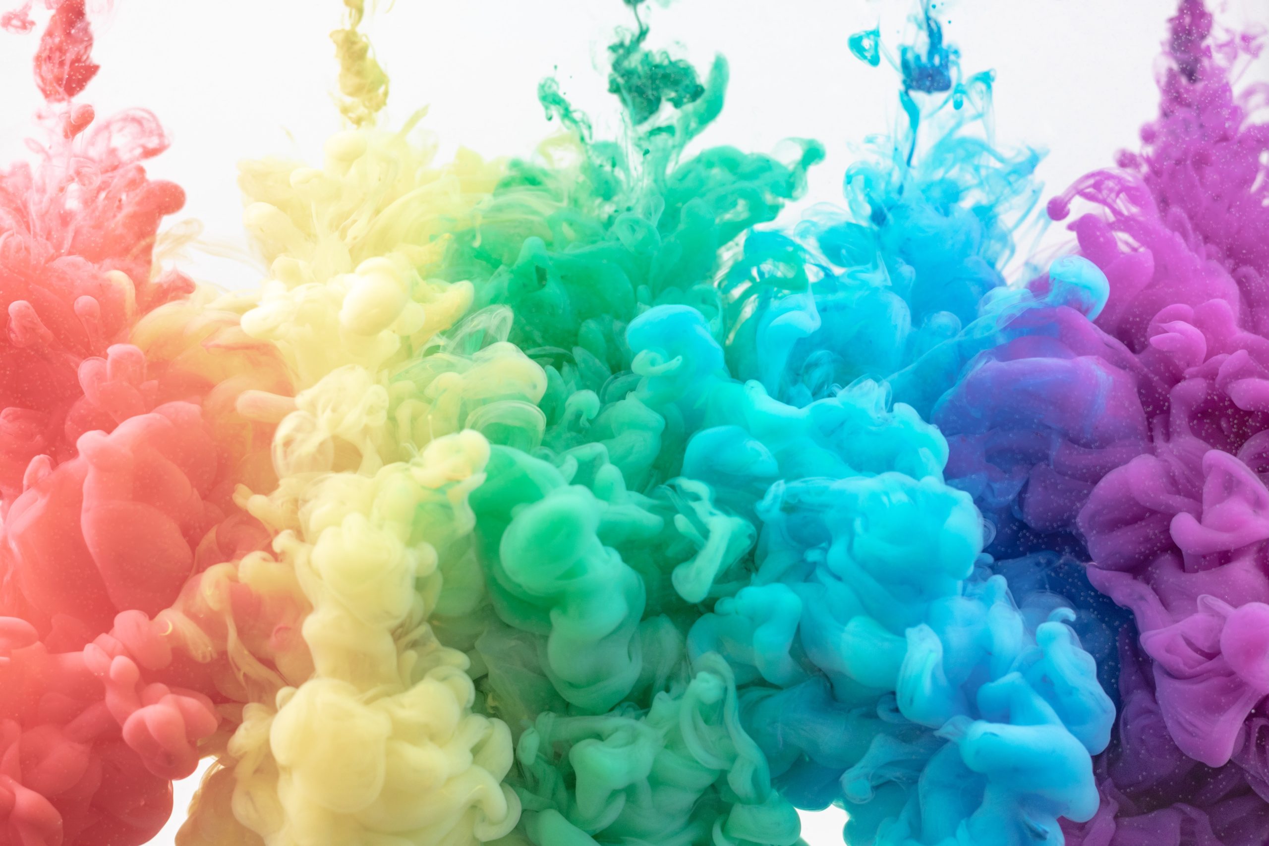
Without going into a full science lesson, let’s dig into a basic breakdown of how different colors can impact us so that you can make the best decisions in your branding, designing and anything else tied into your digital marketing.
Red
A classic color, red is strategically used in all types of marketing to stop consumers in their tracks and call for immediate attention. It’s attractive to impulsive shoppers, and as one of the most aggressive colors on the spectrum, red brings about strong emotions, such as excitement, power and love.
It’s often used for call-to-action buttons and clearance sales because of its power to draw attention.
In addition, red also encourages appetite, so you’ll see it used by many fast food restaurants because the color physically stimulates our bodies, raising our blood pressure and heart rate.
Some brands that use red in their logos:
- Netflix
- Coca-Cola
- Wendy’s
- Target
- CNN
- Pizza Hut
Blue
Evoking feelings of trust, security and strength, the color blue is one of the most versatile to use in digital marketing. In addition, this color curbs appetite, stimulates productivity and represents intelligence.
Its color variance also is a larger factor than with some other colors. For example, lighter blue is actually preferable to darker blue for consumers since darker blue can come off a bit too strong or convey a different message than intended.
You’ll see the color blue used by a lot of financial institutions because of its trustworthiness association.
Some brands that use blue in their logos:
- Samsung
- PayPal
- Ford
- OnStar
- Windows
Green
The color green represents nature, health, freshness, hope, growth and relaxation. It’s also one of the easiest colors for the human eyes to process.
Color variance is also a big factor for green, where dark green reflects wealth and stability.
You’ll often see the color used by companies that have organic, natural and/or fresh products. In addition, green often is used in stores to relax customers. It stimulates harmony in your brain and encourages decisiveness, which is a bonus for companies.
Some brands that use green in their logos:
- Whole Foods
- Animal Planet
- Girl Scouts
- Android
- Starbucks
- Spotify
Yellow
Looking for happiness, positivity and optimism? Look no further than the color yellow, which evokes cheerfulness, youth and clarity.
Yellow can help generate more engagement by adding that touch of positivity to many designs and is often used for exactly that reason.
Some brands that use yellow in their logos:
- Best Buy
- McDonald’s
- Lipton
- Snapchat
- Chevrolet
- Nikon
Orange
Similar to yellow, the color orange also promotes cheerfulness. In addition, there can be feelings of adventure, excitement, enthusiasm and warmth. Orange is often used to draw attention.
Some brands that use orange in their logos:
- Nickelodeon
- The Home Depot
- Soundcloud
- Hooters
- Harley Davidson
- Mastercard
Purple
Nostalgic and sentimental, purple is definitely a favorite of creative and imaginative brands looking to communicate their innovative products and services. Respect and problem-solving also are driven by this color.
Darker tones of purple evoke luxury and royalty, so again, color variance is a factor.
Some brands that use purple in their logos:
- Roku
- Hallmark
- Taco Bell
- Syfy Channel
- Yahoo!
- Twitch
Black
While technically not an actual color (rather the absence of color), black symbolizes sophistication, power and control. In addition, black conveys that a company has reputable and trustworthy products and services to offer. Therefore, it’s commonly used by luxury and technology brands.
In addition, black evokes authority, power, stability, confidence and strength. But it can be overwhelming if used too frequently in your digital marketing.
Some brands that use black in their logos:
- Nike
- Sony
- The New York Times
- Chanel
- Gucci
- Adidas
White
The color white is all about purity, neutrality and safety. It helps with contrast and clarity in digital marketing. For example, “white space” is a powerful design feature that conveys cleanliness.
White is very versatile in its use, and it’s great for any minimalist brands as well.
Some brands that use white in their logos:
- Cotton
- Tesla (in addition to red)
- White Claw
- Mini
- Vans
- Apple
Gray
Potentially uninspiring if used too often, gray brings about feelings of practicality, old age and solidarity. Again, too much can bring about feelings of nothingness and depression.
But color variance can make a positive impact on gray. For example, lighter gray can be used in digital marketing to balance luxury with stability. (Think Lexus.)
Some brands that use the color gray in their logos:
- Wikipedia
- WordPress
- Bassett
- Mercedes-Benz
- Nissan
Now that you understand the power of color psychology, check out these 11 free graphic design tools for the non-designer.
Then, consider leveling up your digital marketing with DailyStory. Features include automating various marketing tasks, dynamic audience segmentations and more. Schedule your free demo with us today.